Tag Archives: Stackpole Books

Portrait transformation

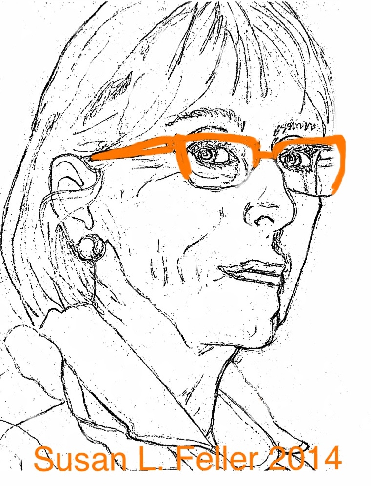
Realism is the quest in my current studies.  I decided to work a self-portrait close to life size using #3 strips (3/32″ wide) for detail.  A group in Harrisonburg, VA brought instructor Donna Hrkman in for three days and I took advantage of her expertise to start the project.   The lesson which stayed with me was to use line of pronounced value to infer shape, attitude, texture, form. Our brain will finish the picture based on its knowledge.

Susan L. Feller 2014

Susan L. Feller 2014

Lesson 1: PREPARE  I sent this photo to Donna who  created a pattern using a grid to enlarge the details.  I also ran the photo through an app for iPad called uSketch and selected a washed out version with strong main lines.

Sketch for self-portrait

Sketch for self-portrait

This image was enlarged to fit a 12 x 16 format and directly sketched  using a lightbox.  I then drew the portrait by eye (ending up with softer features than the direct sketch.) By drawing the pattern myself several times I was prepared to notice nuances and hook the shapes and lines.

Lesson 2: If the subject is close to you, draw the design yourself.  I used Donna’s pattern and my guides trying to replicate what I was seeing not my mind’s interpretation of the subject.  You will see the first image (worked on for two days) needs severe sculpting to become recognizable to my friends as me.

Day 2 Portrait Susan L. Feller, Donna Hrkman pattern

Day 2 Portrait Susan L. Feller, Donna Hrkman pattern

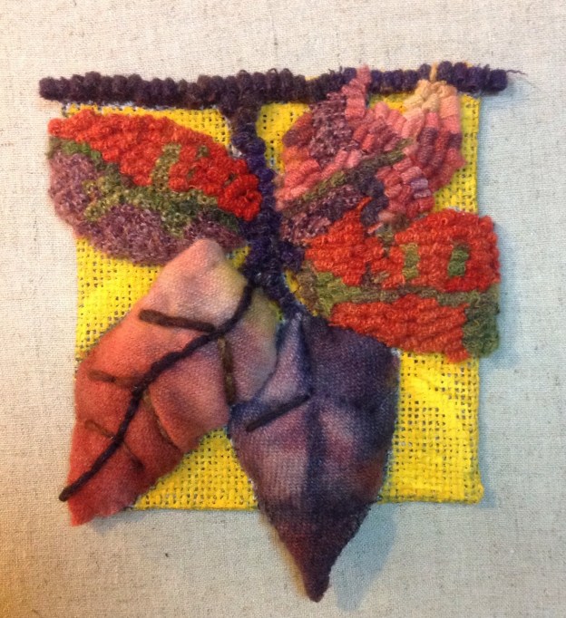
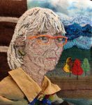
Lesson 3: Color can draw attention and lead the viewer to a conclusion.  Glasses, hair, and background elements are in strong recognizable colors depicting me in 2014. I had brought along the actual drapery fabric from the photo as background but Donna suggested I use symbols to highlight my rughooking journey.

Personality coming through

Personality coming through

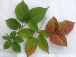
I selected two award winning designs My Mountain State and Mountain Treeline. The abstract hooked blue/purple skyline reproduces the first and the appliquéd colored tree shapes infer the latter and my favorite season. One more element that describes me is living in a log home here in West Virginia.  I decided to take the right third behind the face to show that structure. Simple horizontal lines of dark texture and natural linen became the logs.

Lesson 4: Simplify but complete the story. I almost forgot a major element in Ruckman Mill Farm’s pattern line is FRAKTUR designs. What motifs could I insert into this natural setting that would read PA German folk art? Of course! The circle from Baptism Certificate which has my birth date, parents and my name was printed and laminated to become a pin on the shirt.  I signed the piece and added one more symbol all in one.

Symbols tell story Susan L. Feller

Symbols tell story Susan L. Feller

Lesson 5: If it is not right, fix it.  All along you will notice I got closer to a recognizable rendition of Susan Feller except for the LIPS. Donna said the lower lip usually is lighter because it protrudes slightly.  She suggested using one size larger cut for the lower lip and both larger than the #3 cuts for the face.  I looked at the photo and convinced myself the reverse would be true in my case.  Extreme light and dark values were chosen, wide cuts, narrower, slightly up turned, straight across all not quite right.  I pulled out Anne-Marie Littenberg’s book Hooked Rug Portraits by Stackpole Books and read through it.  There was one image similar to mine that used several different values to portray the light on lips.  Posted that version on Facebook and received accolades.  But it was not until I asked Roslyn Logsdon to critique the lips that I heard the answer: AGAIN—“the lower lip needs to be lighter!!!!!!”

Lesson 6: Use the right tools from your tool box.  My life has involved textiles since childhood. Hand sewing, embroidery, dying fabric and using found objects often shows up in the wall art I create.  No reason to restrict this historical portrait to just rughooking. I added my favorite linen shirt, sea glass jewelry, embroidery and appliqué to enhance the hooked features and intend to finish the piece with a tramp art frame. What fun!


Nature Lessons in Color Planning

When I wanted to illustrate complementary partners in the book ‘Design Basics for Rug Hookers’, Stackpole Books 2011; I chose PURPLE asters and GOLDENrod along the highway near Albany, NY and ORANGE sassafras and a crystal BLUE sky here in WV.

Late summer brings on the subtle changes we glorify as Fall.  These images are good studies in how amount of color and placement affect the motif . They represent RED with its complement GREEN.


This is is a ‘Daily Square’ from late October 2013 depicting a blackberry branch. These photos taken today will inspire several squares.

Look around your environment and select a new color plan.

Blackberry Branch, Susan L. Feller painted linen, hooked, embroidered, quilted

Blackberry Branch, Susan L. Feller painted linen, hooked, embroidered, quilted

Working through a Project

Stained glass artist, Anne-Renee’ Livingston of Virginia Beach, VA created a design which I have interepreted into a pattern for rug hooking (it has also been used by a quilter, ceramist, woodworker, and digital photographer but that is another post).  My title for the pattern is “Mountain Treeline” and it measures 12″ x 24″.  The first time I approached the design I used a bright Fall palette. 


Then I added one more tree and called it “All 4 Seasons” using a bright cheery turquoise sky.  This post is about the neutral colorway and my decision making steps for a third interpretation.  


I like to select as much variety in values, including textural and solid fabrics and not photographed but included are several yarns — alpaca neutrals spun in Hampshire County at Capon Bridge Fiber Works.   Although I call this a “neutral” version it is more towards warm range from natural through deep chocolate and cool jolts of black and gray with some excitement thrown in by the yellow family.

As I got hooking/creating each tree spoke to where it was in the line up, two on left are on another rise beyond one field, the front row definitely has some out in front and others taking back stage.  The brightest (off white) is not the immediate center image, therefore not hitting the viewer in the face and stopping your eye from moving around.  I remembered to experiment with textures behind solids if they are similar in value, adding to the depth.  

Here is where there was a change and some pulling out.  The farthest right tree anchored the edge with a flat gray yarn.  By switching the textured and lighter wool in the tree third from right with the gray I gave a darker value behind the gold  and lighter ending to the righthand edge. 

Second version strong line

First I thought to create some interest by leaving a line of dark gray in the textured tree only.  But that is too strong and drew my eye only to the “branch”. 

removed line

Removed it and hooked the yarns between the two sections instead, better.

Skyline and foreground in golds

 One last decision was the choice of foreground fabrics.  I was certain the golds would be great pulling into all fields that hue and even went to the extent of stitching the two pieces onto the linen backing.  But it just didn’t ring to me.  

The selection of gray plaid for the small field on left and then brown/black plaid as the foreground seems to anchor the design, invite you to view the details, and be drawn all the way to the interesting skyline in the background.   

  I am going to stretch this piece around artist stretcher bars and hand stitch wool around the edges to complete it as the other two are, simple and all fiber. Comments in the form of critiques are welcome.  Question I would pose is would you have stopped sooner in my process and called it finished?

Making Flowers with Nan at Sauder

Nan Loncharich's how-to book


This book is published by Stackpole Books and includes great directions for a wide variety of fabric flower pins. The photographs of completed works inspire the reader to get the materials and begin. Nan signed books and demonstrated at the Sauder Village Rug Hooking Week.
 She includes our ArtWools in many of the creations and has a blog at fancywoolflowers.blogspot.com.  Visit her site to order the book. You can also go to the Westmoreland Museum Gift Shop in Greensburg, PA and purchase a special flower for friends or yourself. 


Loncharich flower using Susan Feller ArtWools

            This gem is made exclusively with our wools and a great button to anchor the petals.